Automating Analyst Workflows Across 3 Internal Products
TL;DR
Three internal products, one common pattern: complex manual workflows holding back practitioners. J+IQ reduced competitive analysis from 72 hours to 15 minutes, saving 1,000+ hours in its first five months across 130 users in five cities. J+Bidding replaced a 5-hour manual API process with a 1-minute interface, supporting $800K+ in revenue. J+Carbon shipped a carbon footprint calculator for advertising campaigns in under two months, developed in partnership with Scope3.
Context
Jellyfish is a digital marketing agency within the BrandTech Group, operating a global network of advertising practitioners: account managers, data planners, media strategists, and paid media specialists working across dozens of countries. Their internal tool suite, the J+ platform, needed to automate the manual analytical work that consumed hours of practitioner time every day.
I worked on three products in this suite between 2022 and 2024. Each started from a different place but shared the same core problem: skilled practitioners spending their time on repetitive manual processes instead of the strategic work they were hired to do.
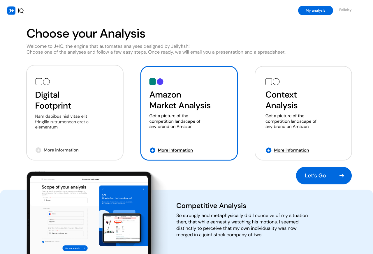
J+IQ
Context
J+IQ was an automated competitive intelligence tool that generated analysis reports comparing a brand against up to five competitors across digital footprint and Amazon market analysis dimensions. Before automation, building a single competitive report required analysts to manually gather data from SimilarWeb, PageSpeed, and other providers, build comparisons, format presentations, and deliver them to clients. The process took approximately 72 hours of analyst time per report.
The tool already existed when I joined, but it was not working well enough for broad rollout. The interface had usability issues that created friction across the workflow, and the product team needed validation before deploying to 130+ analysts across five global offices.
What I Designed
I redesigned the core workflows:
- A stepper interface that guided users through report creation in four clear stages: selecting the brand and country, choosing report type, configuring competitor selection, and monitoring generation progress
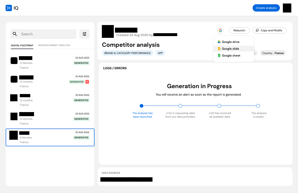
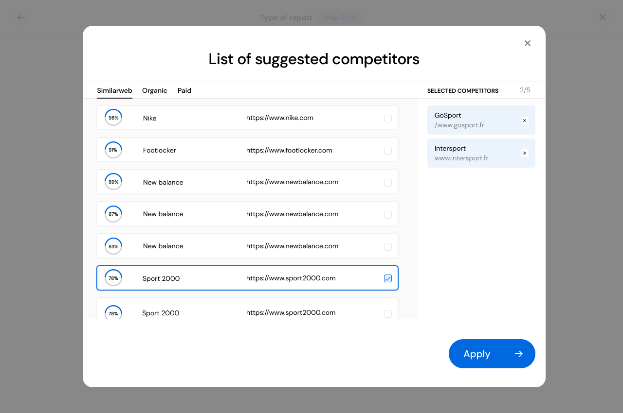
- A competitor suggestion engine that pulled similarity scores from SimilarWeb, organic, and paid data sources, letting analysts select from ranked suggestions rather than manually researching and entering competitor URLs
- An analysis repository with search, filtering by Digital Footprint and Amazon Market Analysis, status indicators, and direct export to Google Drive, Google Slides, and Google Sheets
Usability Validation
I designed and ran a multi-method usability study to validate the redesign. I recruited 7 users from 5 cities (Mexico City, Sao Paulo, Paris, Johannesburg, Brighton) across three experience levels: new users, single-use users, and frequent users. Each session combined a 30-minute exploration task with the standardized SUS questionnaire. I documented findings page by page, categorizing issues by type and providing specific improvement recommendations for every screen.
The tool achieved a SUS score of 83.9, rated "GOOD" and above the 68 industry average. Task completion hit 100%. Individual scores ranged from 75 to 97.5. The study also surfaced targeted fixes: the "Discover competitors" button was not immediately visible, URL copy-paste handling created friction, and status indicator dots were ambiguous. These were the kind of small issues that compound at scale across 130 users.
J+IQ Results
- Report generation time reduced from 72 hours to 15 minutes
- 1,000+ human hours saved in the first 5 months
- SUS score of 83.9 with 100% task completion
- 130 users trained across 5 global cities
J+Bidding
Context
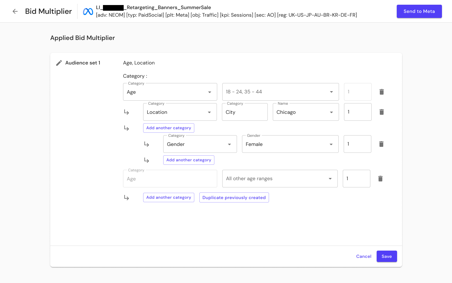
J+Bidding was an ad spend optimization tool spanning two platforms: Meta and Google's DV360. Paid media practitioners needed to apply bid multipliers to fine-tune campaign targeting by demographics, geography, and other audience parameters.
Before this tool, applying bid multipliers on Meta required using the Graph Explorer API directly. This meant writing scripts, knowing technical targeting codes for countries, cities, and demographics, and having no visibility into which campaigns already had multipliers applied or how those multipliers affected spend. The process took approximately 5 hours per calculation, and most practitioners simply could not do it.
Research
I led end-to-end discovery across three countries (Spain, UK, US) with bilingual interview protocols in English and French. I designed distinct question sets for stakeholders (9 categories) and users (7 categories). From this I developed two personas representing the strategic director who needed portfolio-level visibility and the campaign manager who needed step-by-step guidance through a process she found intimidating.
I mapped the current five-stage workflow (Review, Initial Extraction, Modification and Implementation, Sending the Bid, Post-Implementation) with emotional tracking at each stage. Frustration peaked during the modification and implementation phase, the point where practitioners had to manually write API calls and guess at technical codes.
I also conducted shadow sessions observing actual bid management workflows and facilitated workshops that produced a categorized feature roadmap across four domains: bid management, dashboard/overview, simulation/prediction, and documentation/tooltips.
What I Designed
I built J+Bidding from scratch:
- A platform selection landing page where practitioners choose between DV360 and Meta
- Audience set configuration replacing manual API coding with structured selections for age, location, and gender through nested dropdowns, designed to cover 90% of practitioner needs
- Spend visualization showing base bid amounts, actual spend with multipliers, and projected optimal spend on a daily delivery chart
- Automated script generation for DV360 where practitioners configure algorithm parameters and the system generates the script
- A five-level stakeholder model ensuring the interface served everyone from C-Level (total revenue visibility) to Data Science Operations (algorithm creation and modification)
J+Bidding Results
- Bid calculation time reduced from 5 hours to 1 minute
- $800K+ in revenue goals supported
- Bid multiplier access expanded from API-literate specialists to all paid media practitioners
- Discovery research conducted across 3 countries with bilingual protocols
J+Carbon
Context
J+Carbon was a carbon footprint calculator for digital advertising campaigns, developed in partnership with Scope3. The tool let practitioners measure the environmental impact of their media spend and generate sustainability reports.
What I Designed
This was a fast-turnaround project, shipped in under two months with minimal research. I designed:
- Eco report generation with automatic, real-time carbon footprint insights for active campaigns across DV360, Meta, and YouTube
- CSV upload and analysis for manual data imports across additional platforms including TikTok, Snapchat, Pinterest, and Microsoft
- A resource library with educational content on emission types and sustainable advertising practices
- A carbon dashboard for ongoing sustainability metrics
The product also included a Sustainability in Action Slack channel to build an internal community around eco-friendly advertising practices.
Reflections
J+IQ and J+Bidding both ended up in the same place: 99%+ time reductions. But the research that got them there looked completely different. J+IQ needed validation of something that already existed. J+Bidding needed discovery for something that did not exist yet. The methodology I built on J+IQ directly informed how I approached J+Bidding eighteen months later.
J+Carbon was the fastest of the three. The problem was well scoped, the partnership with Scope3 provided the data layer, and the patterns I had already established on the other two products carried over. Under two months from start to launch.
Key Artifacts
Related Case Studies
See all projectsJellyfish / BrandTech Group
The data platform behind 32,000 advertising accounts
Designed the foundational infrastructure — 400+ screens across 22 data connectors — that powers every product in the Jellyfish suite. 500+ enterprise clients depend on it daily. 8.9/10 usability across three distinct user roles.
Platform DesignJellyfish / BrandTech Group
Making AI brand perception measurable for the first time
No category existed. No competitive reference. Designed the first tool that lets brands see how LLMs perceive them — POC in under 3 weeks, 300 qualified leads within 48 hours of launch, tested with C-suite across 4 countries.
AI Product