Making AI Brand Perception Measurable for the First Time
TL;DR
I led design for Share of Model (SOM), a pioneering AI brand analytics tool that monitors how large language models like ChatGPT and Gemini perceive brands -- a product category that did not exist before we built it. I orchestrated discovery research with C-suite stakeholders across 4 countries, designed complex data visualization dashboards where no UX precedent existed, and conducted 5+ hours of structured usability testing that produced 350+ insights. The initial POC launched in under 3 weeks and upon public release six months later generated 1,500 visits, 300 leads, and 12 demos within 48 hours, followed by continued V2 and V3 iterations informed by structured testing.
Context
Jellyfish is a global digital media company within BrandTech Group, serving enterprise brands through data-driven marketing services. As AI language models began reshaping how consumers access information, a strategic question emerged: how do ChatGPT, Gemini, and other LLMs actually perceive and represent brands? Brand strategists had tools for share of voice, share of search, and traditional brand tracking -- but nothing existed for measuring brand presence inside AI models.
The concept for Share of Model originated from a hackathon. It needed to become a real product -- one that could serve both internal Jellyfish consultants running client strategy and external enterprise clients making brand investment decisions. The data was multidimensional: brand awareness across multiple LLMs, sentiment analysis, attribute perception, competitive positioning, and spontaneous awareness trends over time. The stakeholders were senior -- VPs, Managing Directors, and Chief Strategy Officers across four countries -- and they each had different mental models of what brand measurement meant.
This was a zero-to-one design challenge. No established UX patterns existed for AI brand perception dashboards. I was designing a product where the very concepts users would engage with -- how an AI "perceives" a brand -- had no precedent in existing tools.
The Challenge
The difficulty of SOM was not any single design problem -- it was the compound ambiguity.
The data itself was novel. We were not visualizing web analytics or campaign performance -- we were visualizing how large language models respond to prompts about brands. A user might want to understand whether ChatGPT associates their brand with "premium quality" or "affordability," how that perception compares across Gemini and Llama, how it changed over the last quarter, and how it stacks up against three competitors. This is multidimensional data that resists simple visualization.
The users were senior and skeptical. Brand strategists relied on established tools -- YouGov surveys, Google Analytics, share of search metrics -- and needed to trust AI-generated data alongside those validated sources. SOM could not be a novelty; it needed to earn its place in a sophisticated analytical workflow.
The timeline was aggressive. The business needed a proof of concept in under three weeks to capitalize on market momentum. Speed could not come at the expense of rigor -- the POC needed to demonstrate enough depth to convert interest into demos.
And there was the fundamental design challenge: how do you make AI-generated brand perception data comprehensible, trustworthy, and actionable for non-technical brand strategists who have never seen this kind of data before?
My Role
Title: UX Designer
Actual scope: Lead product designer -- end-to-end ownership from discovery through user testing, design strategy, stakeholder research, data visualization design, and UX recommendation roadmapping
Team: Cross-functional team including product owners, tech leads, and developers; I was the design authority
Stakeholder engagement: Direct research engagement with 6 C-suite and VP-level stakeholders across America, England, France, and the Netherlands
In practice this meant conducting strategic discovery research with C-suite stakeholders, making product-level decisions about visualization approaches and A/B testing, producing prioritized UX recommendation roadmaps, and driving the design from concept to production.
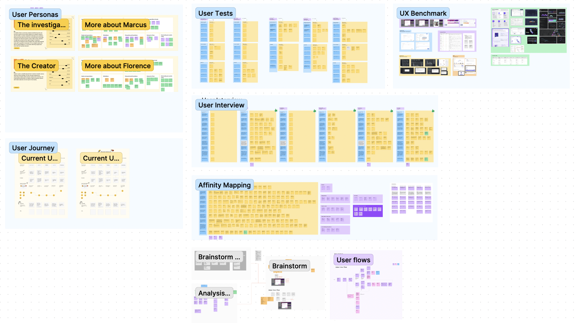
Research & Discovery
Mapping the Brand Measurement Ecosystem: Before designing a single screen, I needed to understand how brand measurement actually works in practice -- and where SOM would fit. I orchestrated discovery interviews with 6+ senior stakeholders across four countries: a VP of Brand Strategy, Managing Directors, a Market Intelligence Director, a VP of Partnerships, a Senior Market Intelligence Director, and a CSO for AI, Planning & Insights.
I mapped the complete brand measurement ecosystem: how SOM would relate to share of voice metrics, share of search data, YouGov surveys, brand trackers, and audience data. I needed to understand not just what these stakeholders wanted from SOM, but how it would integrate into workflows they already trusted.
The discovery produced critical strategic insights. Stakeholders did not want SOM to replace their existing tools -- they wanted it as a diagnostic complement. One stakeholder described it as a way to "start an analysis 3 months in advance" and make client conversations "more productive." Another noted that "good brand data tends to be survey based and expensive... clients would love essentially free data that isn't survey-based." The naming itself was strategic: "part of the success of share of model as a label is that it sounds like share of mind, share of voice -- things that clients are familiar with."
These insights fundamentally shaped the product direction. SOM would not be a standalone analytics platform. It would be a diagnostic tool for opportunity spotting, time savings, and competitive positioning -- positioned to complement, not compete with, established data sources.
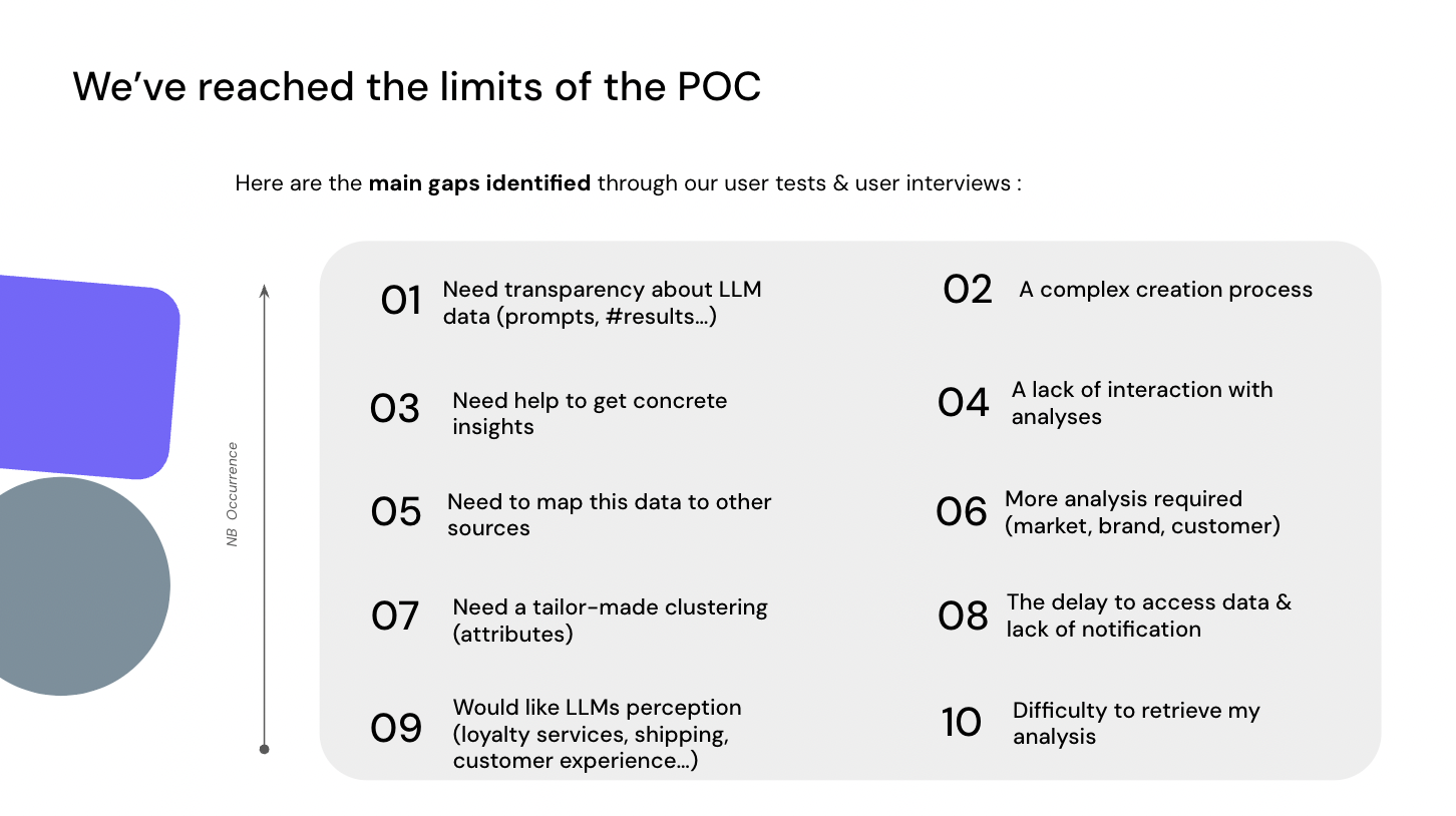
Structured Usability Testing with C-Suite Stakeholders: Once the initial designs were developed, I conducted 5+ hours of structured usability testing with the same 6 senior stakeholders. I designed a 4-part testing methodology:
- User Sentiment: First impressions and overall reactions to the dashboard
- Task Completion: 9 specific tasks with quantified completion rates -- from reading share of voice percentages to identifying competitive outliers and interpreting brand attribute clusters
- A/B Testing: Systematic comparison of specific design alternatives (chart types, layout approaches, filter placements)
- Structured Feedback: Ease of use scoring and qualitative feedback on design direction
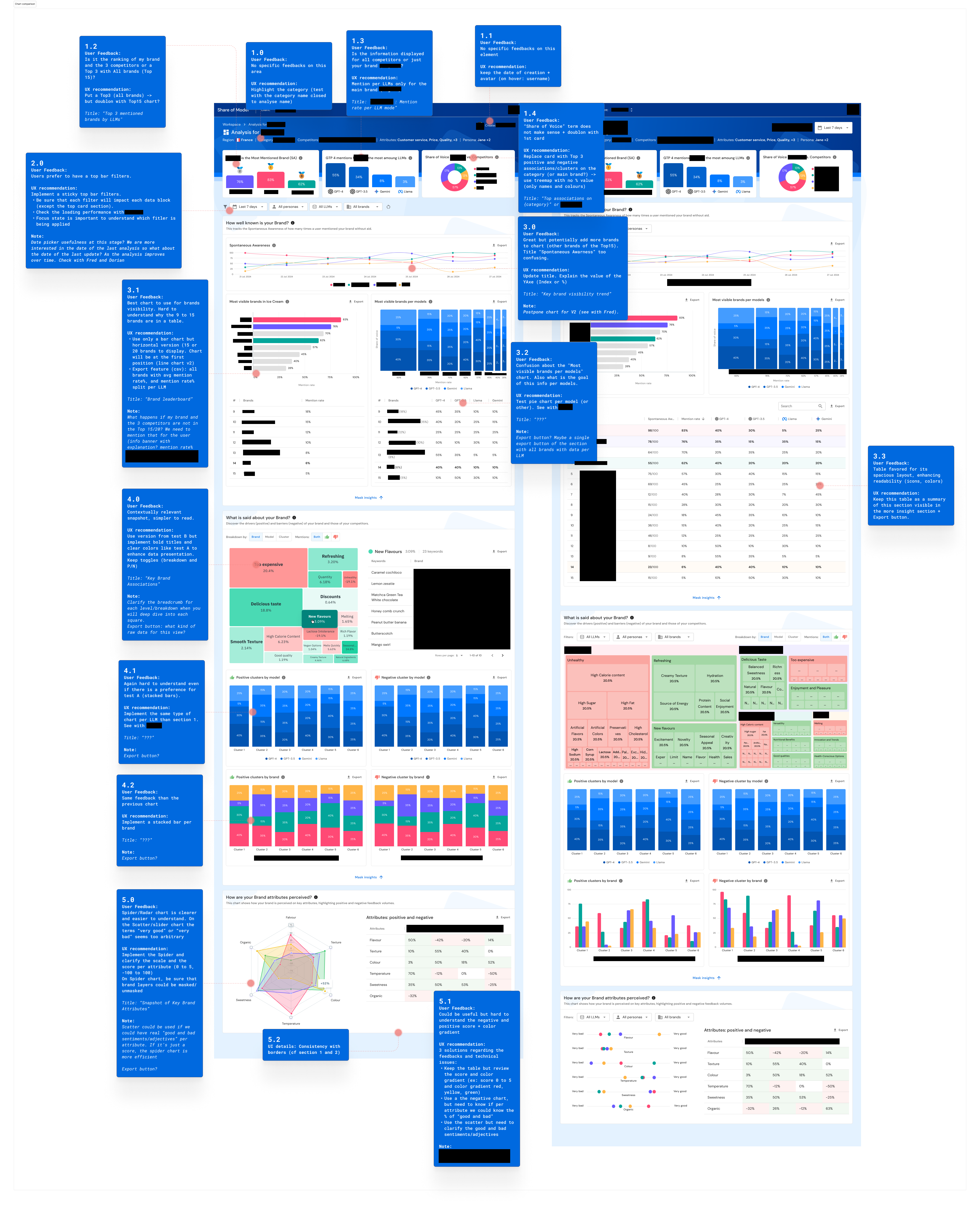
This methodology produced 350+ quantified insights. Every design decision was backed by data. Straightforward data reading tasks (share of voice percentages, mentions comparison, outlier identification) achieved 100% completion. More complex interpretive tasks surfaced where the interface needed refinement.
Terminology Workshop: I facilitated a dedicated Terminology Workshop to resolve naming confusion around concepts like "Spontaneous Awareness" -- a concept that was clear to brand researchers but opaque to other stakeholders. Aligning on shared language was essential before the product could scale beyond its initial users.
Design Process
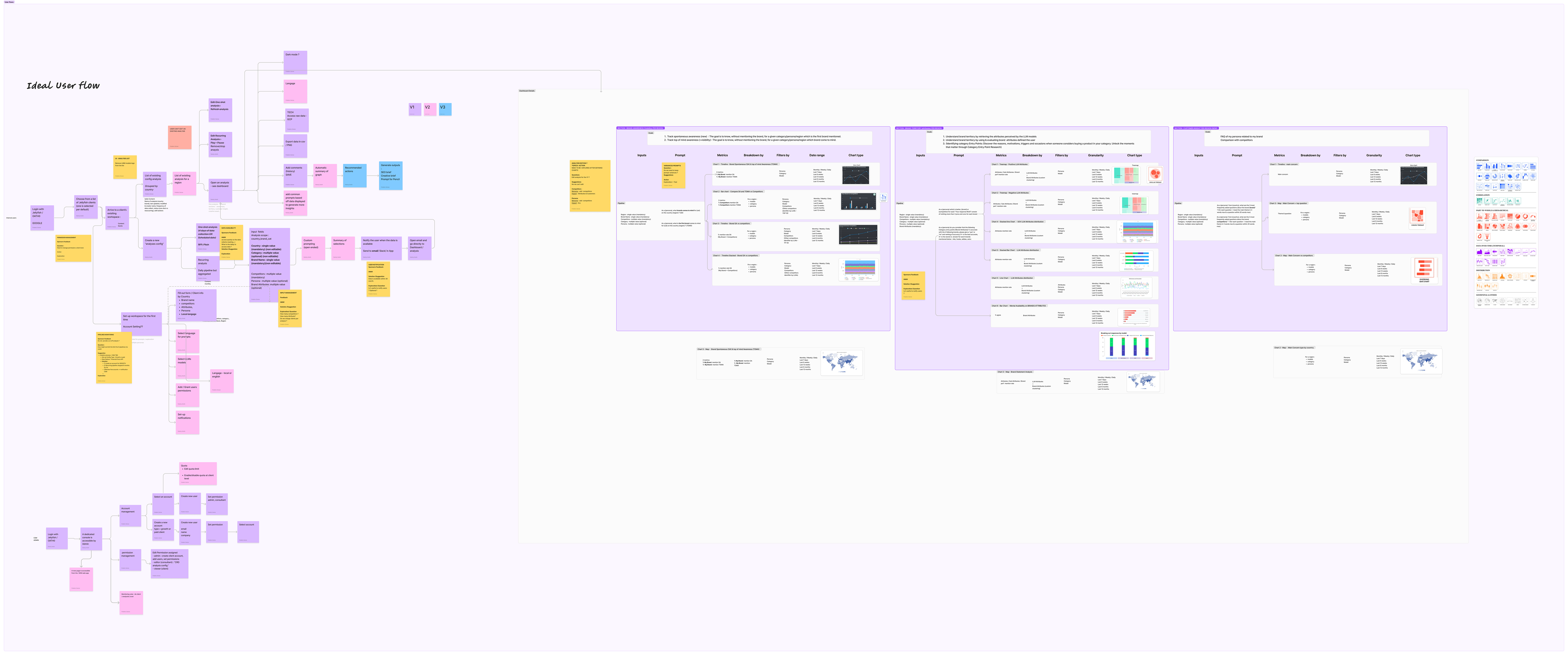
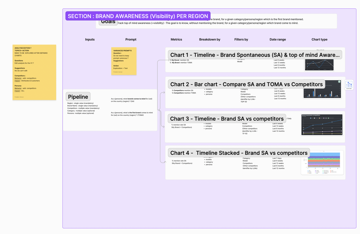
Inventing the Visualization Language: With no UX precedent for AI brand perception dashboards, every visualization decision required testing. I iterated through three major design versions (V1 through V3), systematically evolving the dashboard based on research findings.
Color schemes were reviewed by 3 designers across 5 separate tests to ensure accessibility during extended viewing of data-dense screens. Chart types were not chosen by preference -- they were tested with users:
- Radar vs. scatter charts: 80% of users found radar charts clearer and easier to understand for brand attribute visualization. One stakeholder explained: "A spider chart is more descriptive of what the model is saying about your brand, whether positive or negative. It provides a clear picture."
- Bar vs. stacked bar charts: 80% preferred stacked bar charts for comparing brand metrics across LLMs
- Layout approaches: 60% favored vertically stacked layouts for brand awareness data
- Filter placement: 60% preferred global/top filters over section-level filtering
Each finding translated directly into a design decision. Redundant charts were removed. Scatter plots were replaced with radar charts. Information density was reduced based on feedback that early versions were "overcrowded by information." A global filter system replaced section-level filters.
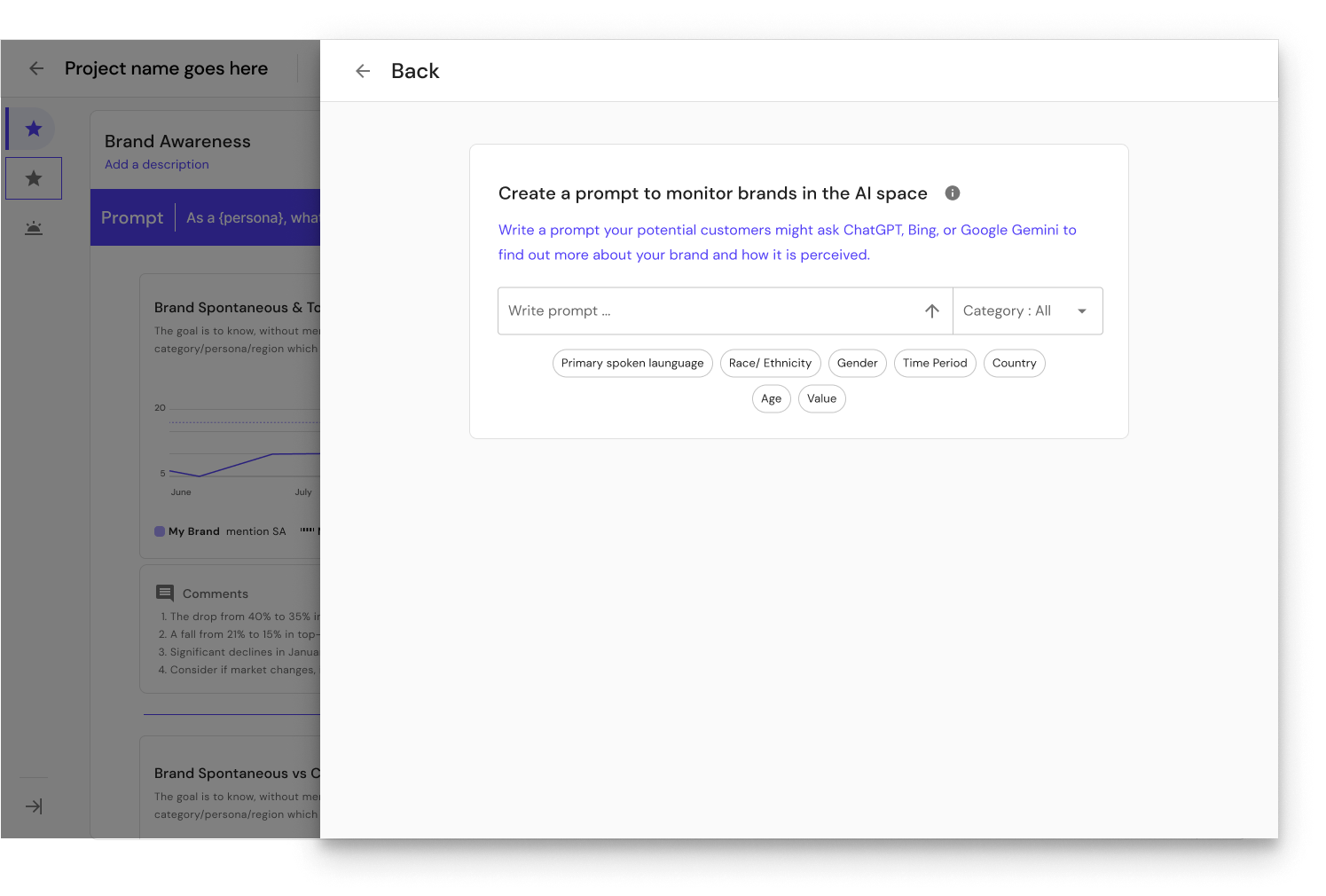
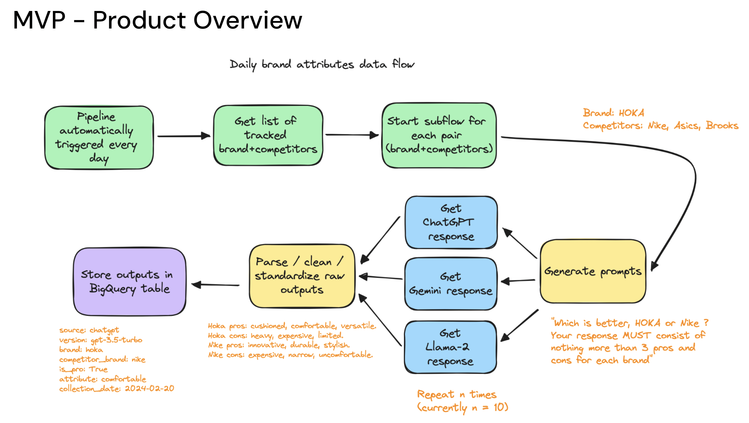
Building Trust Through Transparency: One of the most consequential design decisions was showing AI prompts directly in the dashboard. When users see AI-generated data, their first question is "how was this generated?" Rather than hiding the methodology, I designed the interface to surface the exact prompts used to query each LLM. This transparency was a direct response to stakeholder feedback about needing to trust AI data alongside their validated sources.
From Insights to Roadmap: After testing, I produced a 40-page UX recommendation report with an impact prioritization matrix (High/Medium/Low) and specific ticket-level implementation guidance. This was not a list of suggestions -- it was a development-ready roadmap that translated research findings into actionable engineering tasks.
Solution
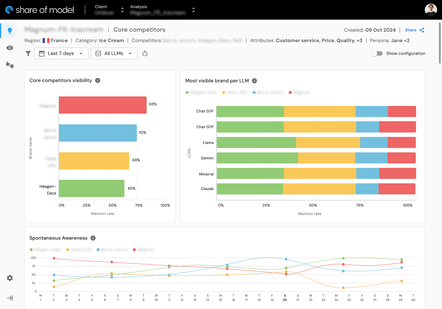
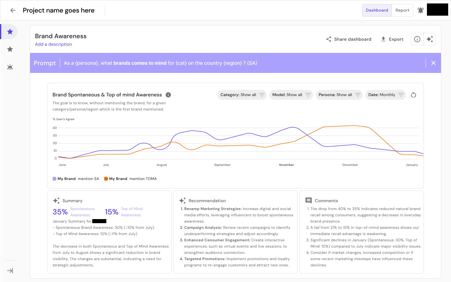
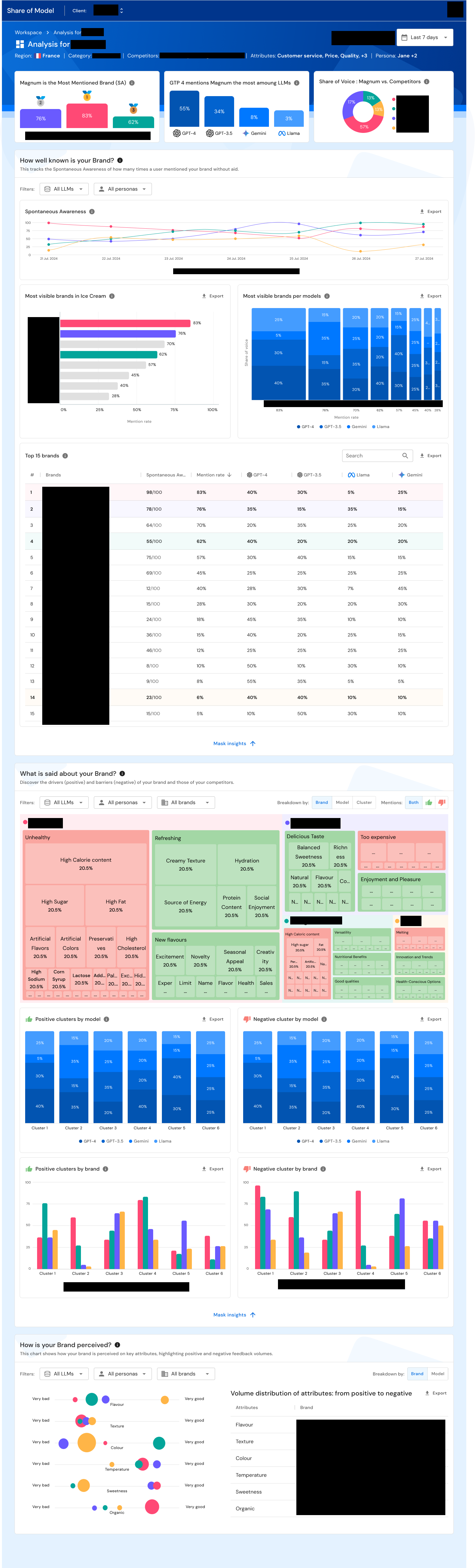
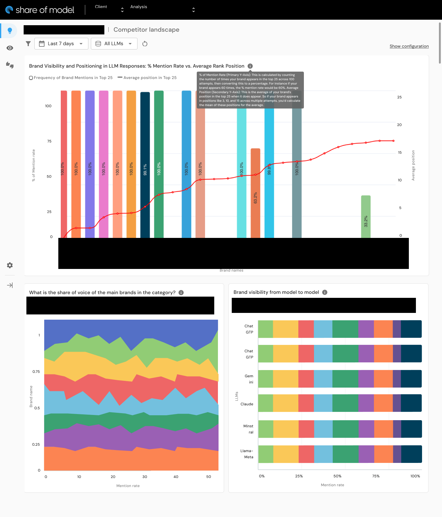
The delivered product was a comprehensive AI brand perception analytics dashboard that enables brand strategists to:
- Monitor brand awareness across multiple LLMs (ChatGPT, Gemini, Llama, and others) with trend analysis over time
- Analyze brand attributes and sentiment through radar chart visualizations showing how each AI model characterizes a brand
- Compare competitive positioning across the AI landscape -- identifying where a brand leads or trails competitors in LLM perception
- Explore spontaneous awareness -- what an AI says about a brand without prompting
- View AI prompts transparently -- building trust by showing exactly how the data was generated
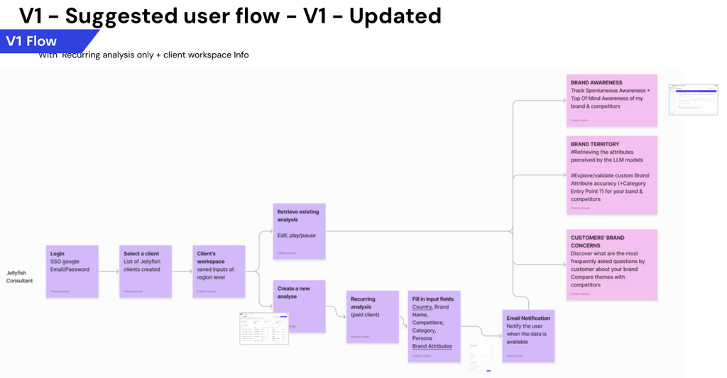
- Generate and manage analyses through a workspace with templates, recurring analysis scheduling, and team collaboration
The dashboard design balances information density with accessibility. Senior brand strategists praised it as "visually appealing, sophisticated, and well-balanced between simplicity and clarity." The progressive disclosure approach -- summary cards with key call-outs, expandable detail sections, and configurable views -- allows users to scan quickly or explore deeply depending on their context.
Results & Impact
<3 weeks
POC launch timeline
1,500
Visits within 48 hours
300
Leads within 48 hours
12
Demos within 48 hours
78%
Ease of use score
100%
Task completion (core tasks)
350+
Insights from testing
40 pages
UX recommendation report
Business Impact
- POC launched in under 3 weeks
- Upon public release six months later: 1,500 visits, 300 leads, and 12 demos within 48 hours
- Close rate described as "super high" for Market Intelligence
- SOM positioned Jellyfish as a pioneer in AI brand analytics, creating competitive advantage in pitches and RFPs
Usability Outcomes
- 78% ease of use score across all tested stakeholders
- 100% task completion for core data reading tasks
- 350+ insights generated from structured testing
- Users described the product as "visually appealing, sophisticated, and well-balanced between simplicity and clarity"
- One stakeholder noted: "There's more detail into brand perception within a large language model, which was always the thing that people wanted to know about"
Research Rigor
- 6 C-suite/VP stakeholders tested across 4 countries (America, England, France, Netherlands)
- 5+ hours of structured usability testing
- 9 tasks tested with quantified completion rates
- A/B testing produced quantified preferences: 80% preferred radar charts, 60% preferred stacked layouts, 80% preferred stacked bar charts
- 40-page UX recommendation report with impact-prioritized tickets guiding continued development
Strategic Positioning
- Stakeholders identified SOM as giving Jellyfish a "PR marketing benefit" that made them "look very innovative and cutting edge"
- Product validated a new category: AI brand perception analytics
- Created integration pathways with existing Jellyfish products (J+Track, J+Search, Pencil) for a compound product suite strategy
Reflections
SOM was the first time I designed a product where the category itself was being invented. No competitor dashboards to benchmark against, no established patterns for visualizing LLM brand perception, no user mental models to anchor to. Every design decision required first-principles thinking grounded in research.
Research methodology matters even more in novel product spaces. Without precedent, you have to build evidence for every design choice. The 4-part testing methodology I developed (sentiment, task completion, A/B testing, structured feedback) produced quantified, actionable insights that converted subjective debates about chart types into clear design decisions. I still use it.
The other thing that shaped SOM was framing it within an existing ecosystem rather than positioning it as a standalone disruption. The discovery insight -- that stakeholders wanted a diagnostic complement, not a replacement for their existing tools -- saved the product from a positioning mistake that would have created adoption resistance.
Core patterns this project demonstrates
- Territory Mapping: Comprehensive ecosystem mapping before designing -- understanding how SOM fits alongside share of voice, share of search, YouGov, and brand trackers across 4 countries of stakeholder context
- Operating Above Title: Conducting C-suite discovery research, making product strategy decisions, and producing prioritized development roadmaps as a UX Designer
- Infrastructure Building: The 4-part testing methodology, the 40-page recommendation report framework, and the design update presentation structure ("How we bring value / What we're solving / Next actions") are all reusable process infrastructure
SOM was a new product in a new space. The research methodology and testing frameworks I built for it did not stop there -- Jellyfish has since applied similar approaches to SEO. The work scaled beyond the product.
Key Artifacts
Related Case Studies
See all projectsISEA Multimedia Digital Campus
Dark patterns, cognitive bias, and ethical design
Investigated how dark patterns exploit cognitive biases through neuroscience, behavioral economics, and regulatory analysis. Translated the research into LUX UX — a complete startup concept with market sizing ($183M-$356M), competitive benchmarking, and financial projections. 91% of surveyed users wanted dark pattern alerts.
Academic ResearchJellyfish / BrandTech Group
Automating analyst workflows across 3 internal products
Three internal tools, one common pattern: replacing manual processes with designed interfaces. J+IQ cut competitive reports from 72 hours to 15 minutes, saving 1,000+ hours across 130 users. J+Bidding replaced a 5-hour API process with a 1-minute interface, supporting $800K+ in revenue. J+Carbon shipped a carbon footprint calculator in under two months.
Workflow Automation