Redesigning the French Ministry of Defense Web Portal Across 26 Agencies
TL;DR
As a junior UX designer at the French Ministry of Defense, I worked across 26 government agencies -- facilitating 9+ co-design workshops, designing standardized research instruments, and contributing to the DSFR (State Design System) as a design partner on one of the first government websites built on it. The redesign introduced profile-based entry points so different user groups (youth, professionals, journalists, researchers, veterans, military families) could navigate directly to what they came for. The site launched March 15, 2022.
Context
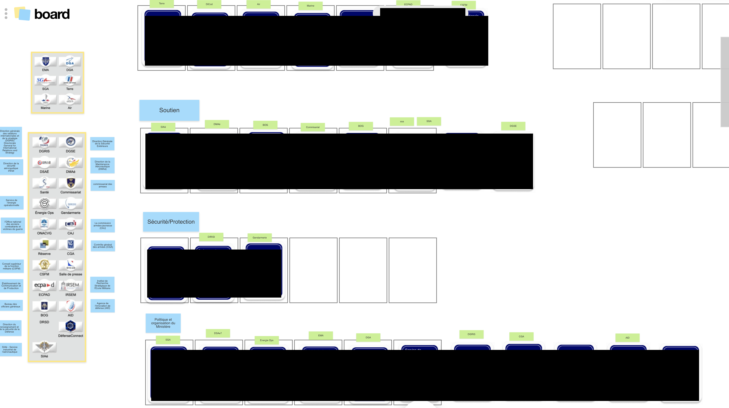
The French Ministry of Defense (Ministere des Armees) public web portal defense.gouv.fr spans 26+ organizational sub-sites -- each managed independently by a different military or civilian agency (DGA, SGA, SCA, BOG, CGA, DIRISI, and others), each with its own communication team, editorial process, and institutional priorities. The portal serves military personnel, students exploring career options, journalists, veterans, job seekers, and the general public.
I joined the DTPM (Delegation for Transformation and Ministerial Performance) -- the ministry's digital transformation unit -- as a UX design apprentice in 2020. "Apprentice" in the French system (alternante) is a specific educational structure where students alternate between academic study and professional work. It is a recognized professional role, but it is entry-level. I worked within a design team of five, reporting to a manager who directed the overall effort.
The ministry had decided to redesign defense.gouv.fr. No UX practice existed within the organization. Many agency representatives could not answer basic questions about their own users' behavior. There was no shared digital strategy across agencies, no research methodology, and no mechanism for cross-agency collaboration on design.
The Challenge
The challenge was organizational as much as it was a design problem.
26 agencies, zero shared understanding: Each agency sub-site had been built and maintained independently. There was no unified picture of the portal's structure, usability, or user needs. Some agencies had sophisticated web teams; others had a single communications officer managing their entire digital presence. When I deployed standardized questionnaires across agencies, some representatives answered "PAS DE REPONSE" (no response) to basic questions about their users -- they simply did not know.
Institutional complexity: The French government has strict digital standards. The DSFR (Systeme de Design de l'Etat / State Design System) governs visual and structural consistency across 20,000+ state websites. RGAA accessibility requirements mandate compliance at a level comparable to WCAG AA. Military security constraints separate internal systems (IntraDef) from public-facing platforms. Legacy CMS limitations constrained what was technically achievable. And above all: military hierarchy and protocol shaped every stakeholder interaction.
Cultural unfamiliarity with UX: User-centered design was a new concept within the ministry. Before stakeholders could participate in research, they needed to understand what UX was, why it mattered, and how the process would work.
Multiple concurrent products: The MINARM website redesign was the primary project. I also worked on UX for two other ministry applications (LPB and Atrium) in parallel.
My Role
Title: Alternante en UX design (UX Design Apprentice)
Team: Five designers within the DTPM, plus project managers, developers, and Lab Design team members. I co-facilitated workshops with senior DTPM staff.
What I did: Facilitated co-design workshops, conducted user interviews and usability testing, mapped site architecture, designed standardized research instruments, and contributed to DSFR component development as a design partner.
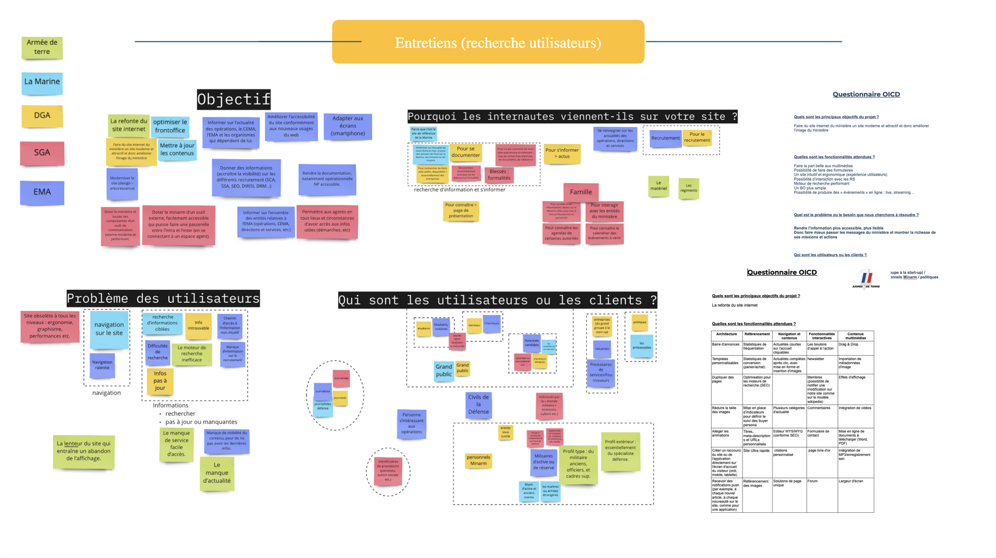
Research & Discovery
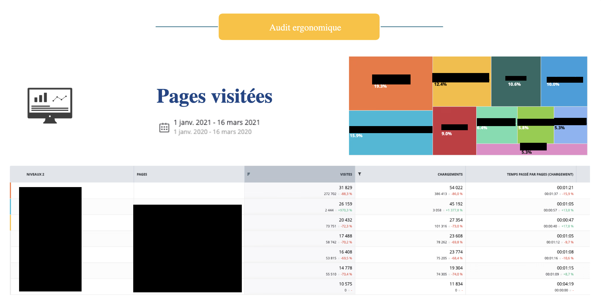
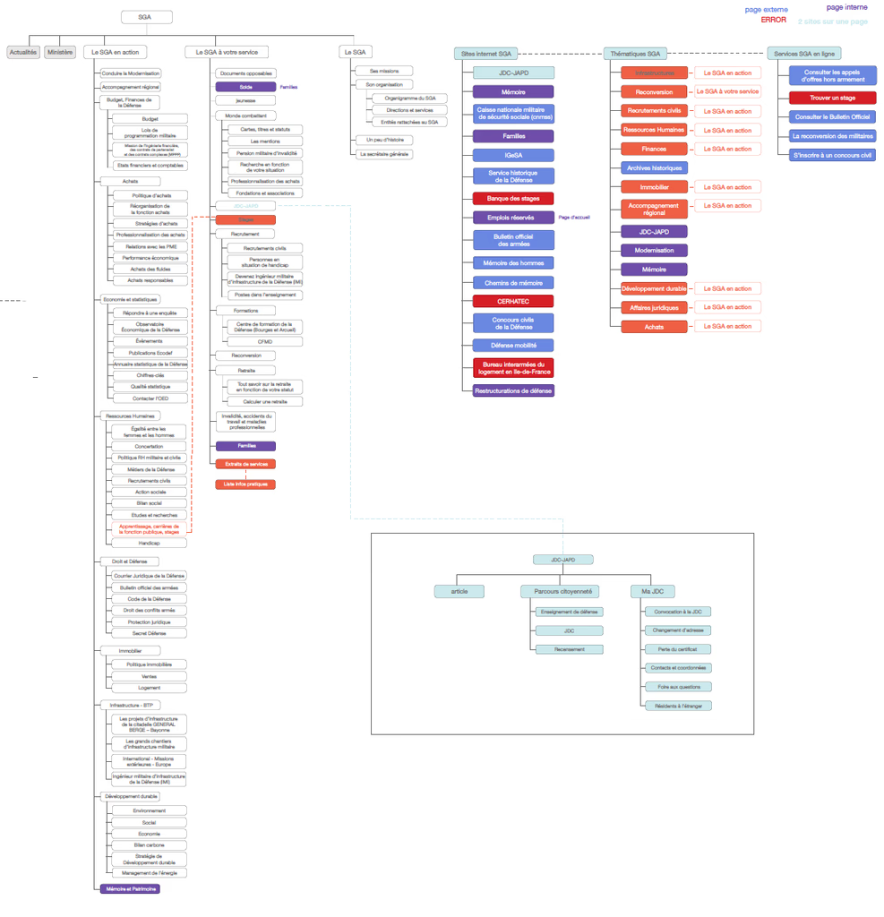
Mapping the Digital Territory: Before proposing any design direction, I conducted a systematic audit of the existing defense.gouv.fr portal. I created a multi-sheet spreadsheet documenting every page, every link, and every navigational pathway across the ecosystem -- 291+ rows cataloguing homepage links, 426+ rows documenting sub-site pages, plus tabs for SEO metrics, content structure, and usability observations.
The audit revealed the baseline: Alexa rank 1,379 in France, 4.0 daily page views per visitor, 4:08 average daily time on site, 42.6% bounce rate, 147 in-page links (96% internal), no custom 404 page, no social media structured data, and 74 images with 5 missing alt attributes.
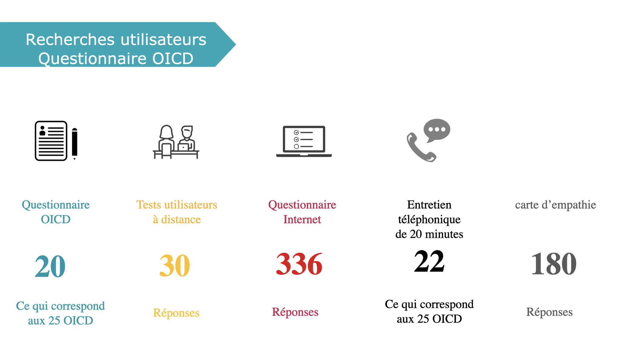
Standardized Research Across Agencies: I designed a standardized questionnaire and deployed it across 5+ agencies (DGA, SGA, SCA, BOG, CGA). The questionnaire covered project objectives, user profiles, user behaviors, pain points, current functionality assessment, improvement priorities, and proposed changes. Every agency received the same instrument, producing comparable data that could be synthesized into a unified understanding of 26 organizations' needs.
The standardized format meant any team member could deploy the same instrument to a new agency, and the data would be directly comparable to what had already been collected.
100-Slide Competitive Benchmark: In March 2022, I produced a comprehensive benchmark analysis spanning approximately 50+ reference websites across 5 categories: events and calendar pages, in memoriam and memorial pages, interactive cartography, key figures displays, and job offer pages. The analysis covered French government sites (numerique.gouv.fr, systeme-de-design.gouv.fr, gouvernement.fr), international institutions, museums, and commercial sites. The benchmark grounded design decisions in what other organizations were actually doing.
Design Process
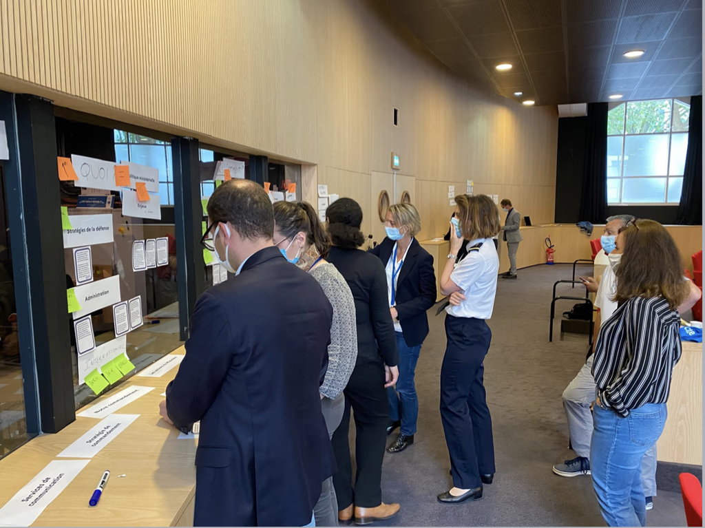
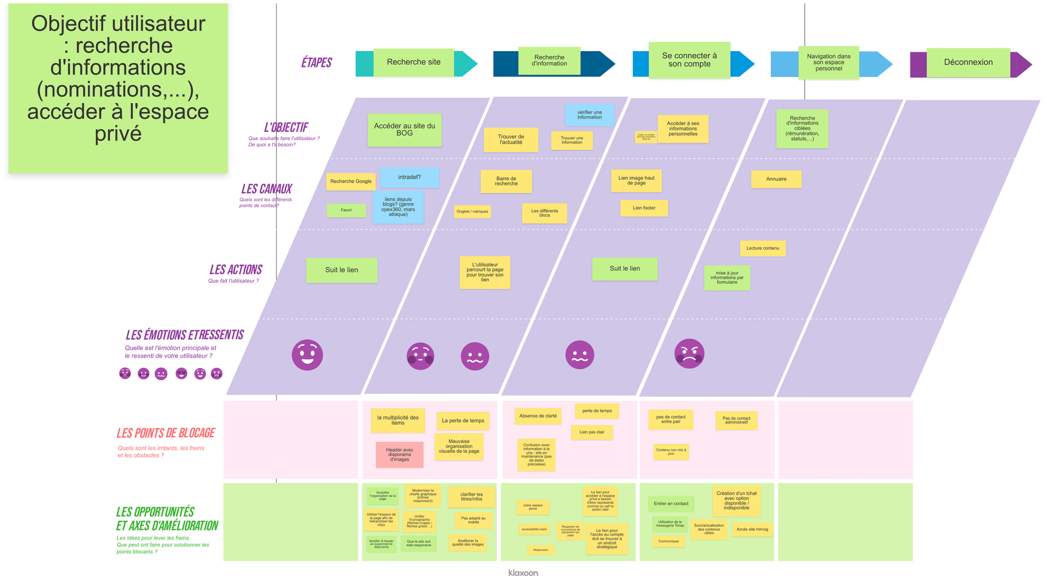
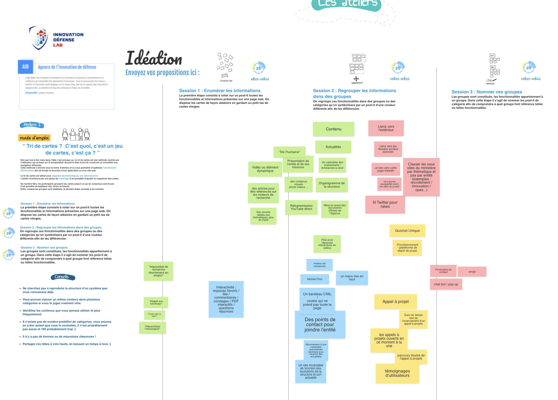
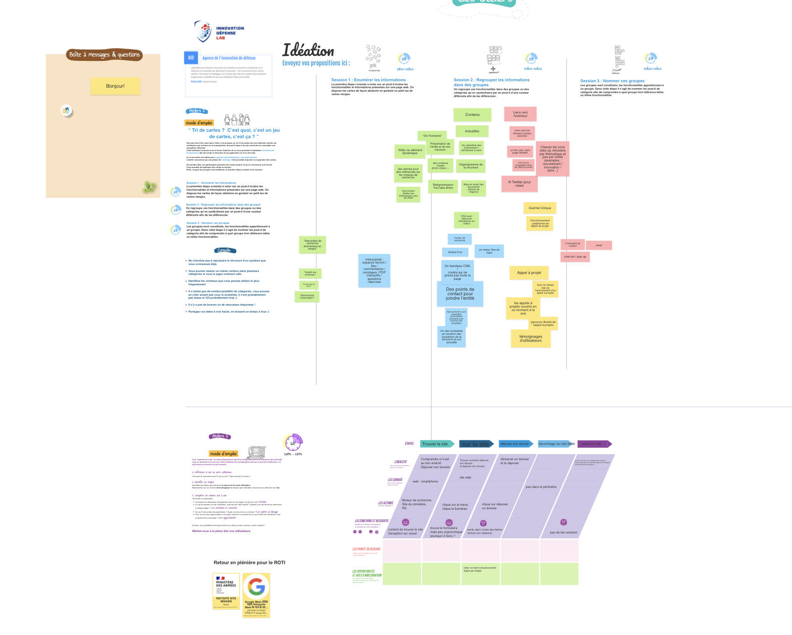
9+ Co-Design Workshops Across 3 Weeks: I co-designed and co-facilitated 9+ workshops across three weeks in May 2021, organized in three progressive waves:
Wave 1 -- Card Sorting and Experience Mapping (May 11): Three parallel sessions with participants from DGA/BOG, SCA, and SGA groups. Participants sorted content categories, mapped their current experience navigating the portal, and documented pain points and information-seeking patterns. These sessions established the baseline understanding of how 26 agencies experienced their shared digital platform.
Wave 2 -- Tree Testing and Prioritization (May 20): Three parallel sessions where participants tested proposed information architectures through tree testing exercises and used prioritization matrices to rank features and content areas by importance. These sessions validated (or invalidated) the structural direction emerging from Wave 1 findings.
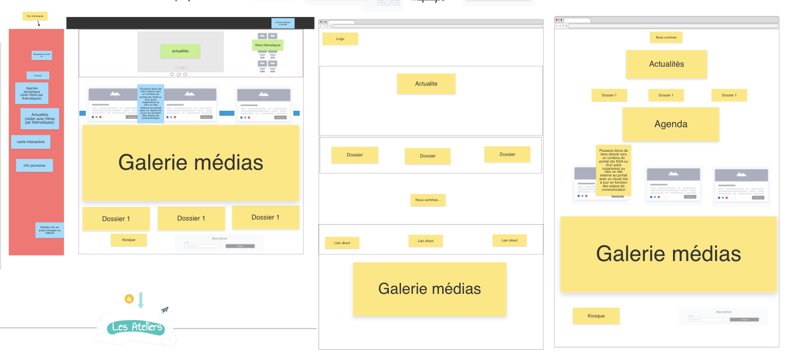
Wave 3 -- Brainstorming and UI Creation (May 27): Three parallel sessions focused on solution generation -- brainstorming exercises, card games to explore content relationships, and collaborative UI sketching where stakeholders drew their ideal interface concepts.
The workshops brought together representatives from DGA, SGA, SCA, BOG, CGA, DIRISI, ONISEP, and Uneo -- military officers, civilian administrators, cybersecurity experts, business school professors, and students. A military general and a student working side by side on a prioritization matrix.
The facilitation rules displayed at the start of every session: "Everything is worth saying. No judgment. Censorship and self-censorship are forbidden. Prioritize quantity over quality. Whatever happens, don't take it personally."
After each wave, I synthesized outputs into standardized RETEX (Return on Experience) documents for each agency -- capturing blocking points, improvement axes, and workshop results in a traceable format that connected stakeholder input to design decisions.
User Testing: For the MINARM V.1 site, I designed a structured testing protocol: 60-minute sessions with 5 testers across 3 user profiles (youth, professional, military intern), testing on both desktop and mobile. The protocol followed a 3-phase structure -- free exploration with prompted questions, specific scenario tasks, and a post-test questionnaire covering ergonomics, readability, wording, and hierarchy.
Testing revealed critical navigation problems. Users consistently became confused when moving between the main site and sub-organization sites -- menus changed without warning. Search returned irrelevant and poorly categorized results. Pages were overwhelmingly long with too much news content. Users could not find practical information they came for -- job applications, contact details, recruitment information. Verbatims: "This site is not logical and very long." "Too many articles everywhere." "It's a rabbit hole." "Lots of communication but the rest is impossible to find. I don't go on the military site for PR -- I go there to work."
Building With the DSFR: The DSFR (Systeme de Design de l'Etat) was being actively built while we were designing the portal. Our site was one of the first ever built using it, and we worked directly with the DSFR team as design partners -- hours in conference rooms building and testing components, working through color systems and gradients against RGAA accessibility standards, and creating page patterns that had never existed before. Some of the components we contributed to are now used across 20,000+ state websites.
Solution
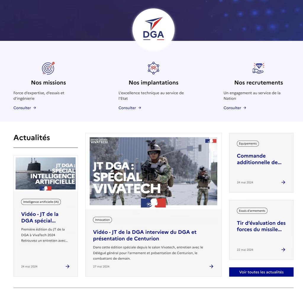
Profile-Based Portal: The biggest structural change was how users entered the site. Instead of a generic homepage where everyone had to find their own way, users choose their profile on arrival -- jeune, professionnel, journaliste, chercheur, ancien combattant, or famille d'un personnel -- and the homepage reconfigures around that. Each profile opens direct entry points into the content that group actually comes for. Youth looking for their journée d'appel dates and school scheduling don't have to navigate through military procurement sections. Journalists get a dedicated salle de presse without press content flooding the front page for everyone else. The architecture came directly from what the workshops and testing revealed about how different user groups actually used the portal.
DSFR Implementation: The portal was one of the first government websites built on the DSFR. We implemented the design system while it was still being finalized -- creating new page patterns, building components to RGAA accessibility standards, and establishing rules for color, typography, and layout that would need to work across the 26 agency sub-sites.
Redesigned Information Architecture: The workshop-driven information architecture replaced the fragmented, agency-centric structure with a user-need-centered navigation model. Tree testing validated the new structure with stakeholders from across the ministry.
Reusable Research Infrastructure: Alongside the design deliverables, I built process infrastructure:
- Standardized OICD questionnaire -- deployable to any agency, producing comparable data across organizational boundaries
- Workshop facilitation templates -- structured agendas with timed exercises, rules, and facilitation guides
- User test protocol -- reusable testing framework with defined phases, participant profiling, task scenarios, and analysis structure
- RETEX documentation framework -- standardized post-workshop synthesis format
- UX methodology presentation -- a 7-step process framework (Audit, Interviews, Personas, Empathy Maps, Workshops, Wireframes, User Tests)
These were designed to be reusable -- any team member could pick them up and run the same process with a new agency.
Educational Foundation for UX Practice: I created a 50-slide "What is a UX designer?" presentation tracing UX from ancient Greek ergonomics through Toyota's human-centered production systems to modern ISO standards, designed for ministry personnel with no prior exposure to the discipline. I also created a presentation for the Salon Fabrique Defense -- a defense industry trade show -- covering research techniques, workshop facilitation, prototyping, and evaluation scales (SUS, UMUX-lite, DEEP, AttrakDiff).
Results & Impact
26+
Agencies researched
9+
Workshops facilitated
100+
Stakeholders participated
50+
Reference sites benchmarked
20,000+
State websites using the DSFR we helped build
- One of the first government websites built on the DSFR -- components contributed to the design system now used across 20,000+ state websites
- Profile-based entry points for 6 user groups, replacing the generic homepage
- 5 reusable process artifacts built and deployed (questionnaire, facilitation templates, test protocol, RETEX framework, UX methodology)
- RETEX format adopted across all agency workshop documentation (confirmed across BOG, CGA, DGA, SCA, SGA)
- Site launched March 15, 2022
Reflections
Eighteen months, a small team, and 26 agencies to coordinate. The DSFR was being built at the same time we were building on it. The accessibility standards were strict. The military hierarchy shaped every interaction. It was a lot of work in a compressed timeline, and the scale of it -- our last workshop had over 100 people in person -- is something I still haven't matched since.
This is where I learned to map an ecosystem before designing in it, to build research instruments that other people could reuse, and to facilitate across organizational silos. The constraints forced rigor and every decision needed evidence.
Key Artifacts
Related Case Studies
See all projectsJellyfish / BrandTech Group
Discovering the shadow workflows an entire company didn't know about
Concurrent research across two data products revealed that users had built an entire hidden workaround ecosystem. The findings didn't just improve the product — they redirected the roadmap.
Discovery ResearchMarigold (now Zeta Global)
Establishing UX research infrastructure across 6 products
Six enterprise products, no shared research practice. Built the infrastructure from scratch: UX Foundations for five products, methodology guides, a research portal, standardized processes. Over 20 independent research efforts in eight months, now used independently by the full UX team and 15+ product managers.
Research Infrastructure