Discovering the Shadow Workflows an Entire Company Didn't Know About
TL;DR
As the sole UX designer assigned to J+Track and J+Report at Jellyfish, I simultaneously led research programs across both complex data products -- J+Track (analytics tracking plan management) and J+Report (data pipeline management for 500+ clients). I applied six distinct research methods including a European heuristic framework rarely used in American industry, uncovering that users had built an entire parallel ecosystem of workaround tools because the product failed them at critical moments. The work established the first evidence-based design foundation for both products and demonstrated a repeatable methodology for systematic product assessment.
Context
Jellyfish is a digital marketing agency within the BrandTech Group, operating a suite of proprietary data tools -- the J+ product line -- serving global advertising and analytics teams. J+Track was the company's analytics tracking plan management tool, used by Analytics & Optimization consultants worldwide to create, manage, and export GA4 tracking plans for client websites. J+Report was the core data pipeline management platform, enabling 500+ clients managing 32,000+ accounts to connect, transform, and visualize data from dozens of advertising, analytics, CRM, and data warehouse sources.
When I arrived at Jellyfish in 2022, UX research and design practices were inconsistent across products. Product decisions were often being made without systematic user input. Neither J+Track nor J+Report had ever received a formal UX assessment. I was the sole designer assigned to both.
The Challenge
J+Track had a unique market position -- users would say things like "I worked for a lot of consulting companies and nothing exists like this!" -- but adoption was low and falling. The product team knew something was wrong, but without structured research, they could not identify what, where, or why. The interface was not responsive, naming conventions were inconsistent with industry-standard Google Tag Manager terminology, documentation was incomplete, and no usability baseline existed.
J+Report faced a different but equally pressing challenge: the platform needed to scale from approximately 60 data source connectors to 175+. The existing interface lacked clear navigation, produced confusing error messages, and imposed heavy cognitive load on users -- problems that would only multiply with scale. Users reported connection timeouts, broken connections, and API update disruptions. Some had been using the tool for 7+ years; others were brand new. Serving both simultaneously required a fundamentally rethought information architecture.
I had to run research programs for both products concurrently, from January through October 2023, with no research team, no existing templates, and no organizational precedent for this kind of work.
My Role
Title: UX Designer
Actual scope: Sole UX researcher and designer across both products. I owned the complete research lifecycle for each -- study planning, participant recruitment coordination, interview facilitation, testing execution, data analysis, synthesis, presentation, and design. For J+Track, I was explicitly credited as "UX Research -- Felicity" in the interview documentation. For J+Report, I was listed as UX Designer on a four-person cross-functional team alongside a Product Owner, Lead Software Engineer, and Senior Engineering Manager -- but I owned every UX deliverable.
Team structure: I collaborated with Product Managers (Alessandro for both products) and CSMs (Yohan, Ishita) for participant recruitment and facilitation support, but all research design, methodology selection, execution, analysis, and design output was mine.
Research & Discovery
J+Track: The Most Methodologically Rigorous Assessment in My Portfolio
I designed a six-method research program to build an irrefutable evidence base:
1. User Interviews (8 participants, 4 countries, 5+ hours)
I conducted structured 30-minute interviews with users across Australia, Brazil, France, and Israel, spanning junior to expert skill levels. I designed a 12-question structured guide covering purpose, goals, behaviors, tools, and improvement desires. The interviews revealed fundamental mismatches between user expectations and product behavior -- and the first hints of an extensive workaround ecosystem.
2. Bastien & Scapin Ergonomic Audit (50 elements)
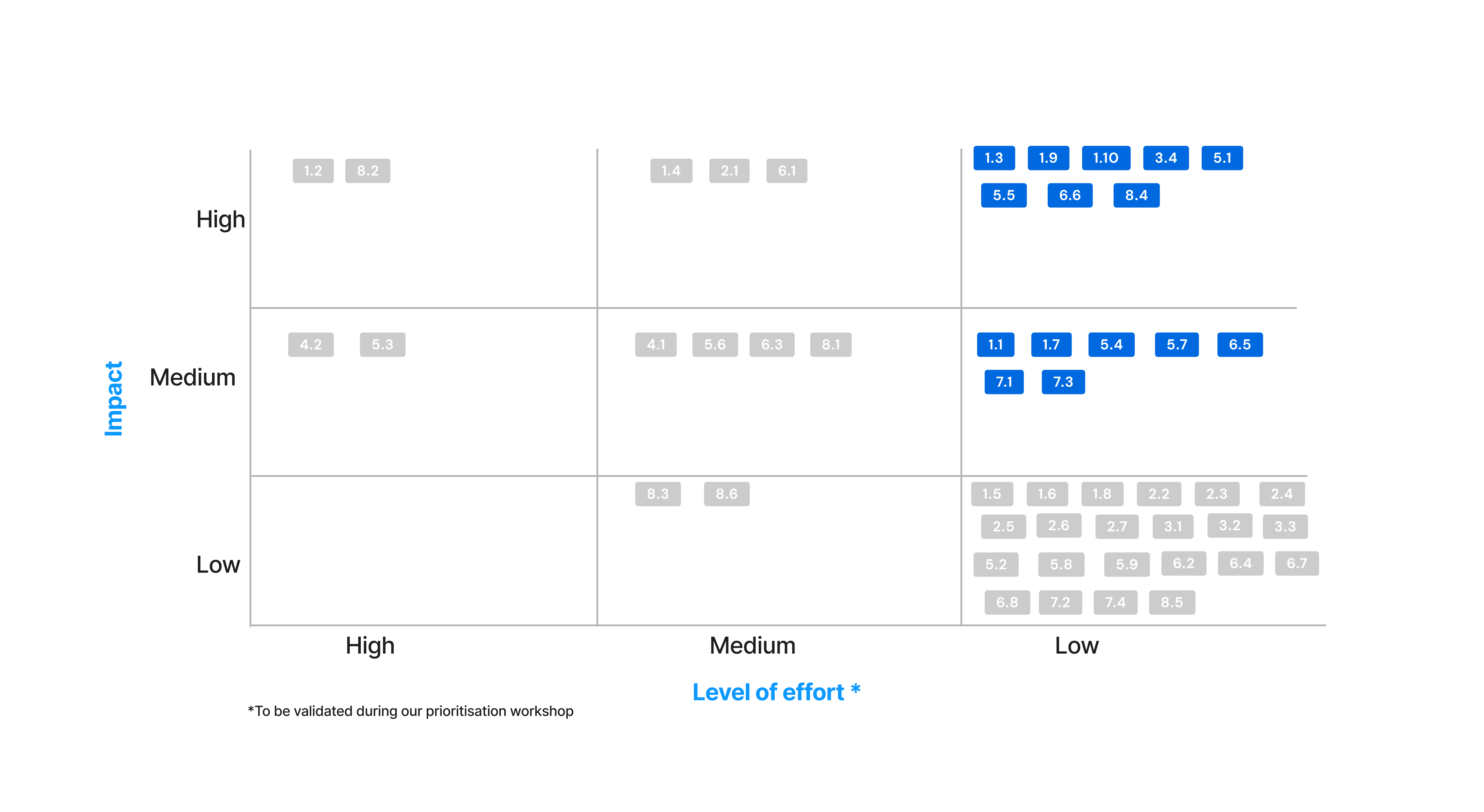
This was the methodological backbone of the J+Track assessment. Bastien & Scapin is a French eight-criteria heuristic framework -- Guidance, Workload, Explicit Control, Adaptability, Error Management, Consistency, Significance of Codes, and Compatibility -- that provides more granular evaluation than standard Nielsen heuristics. I systematically evaluated every interaction point in J+Track, producing a structured spreadsheet with IDs, descriptions, locations across nine product areas, heuristic violations, severity ratings, and specific recommendations. The result: 50 identified usability issues -- 8 high-severity (including data loss risk and event save failure), 15 medium-severity, and 27 low-severity.
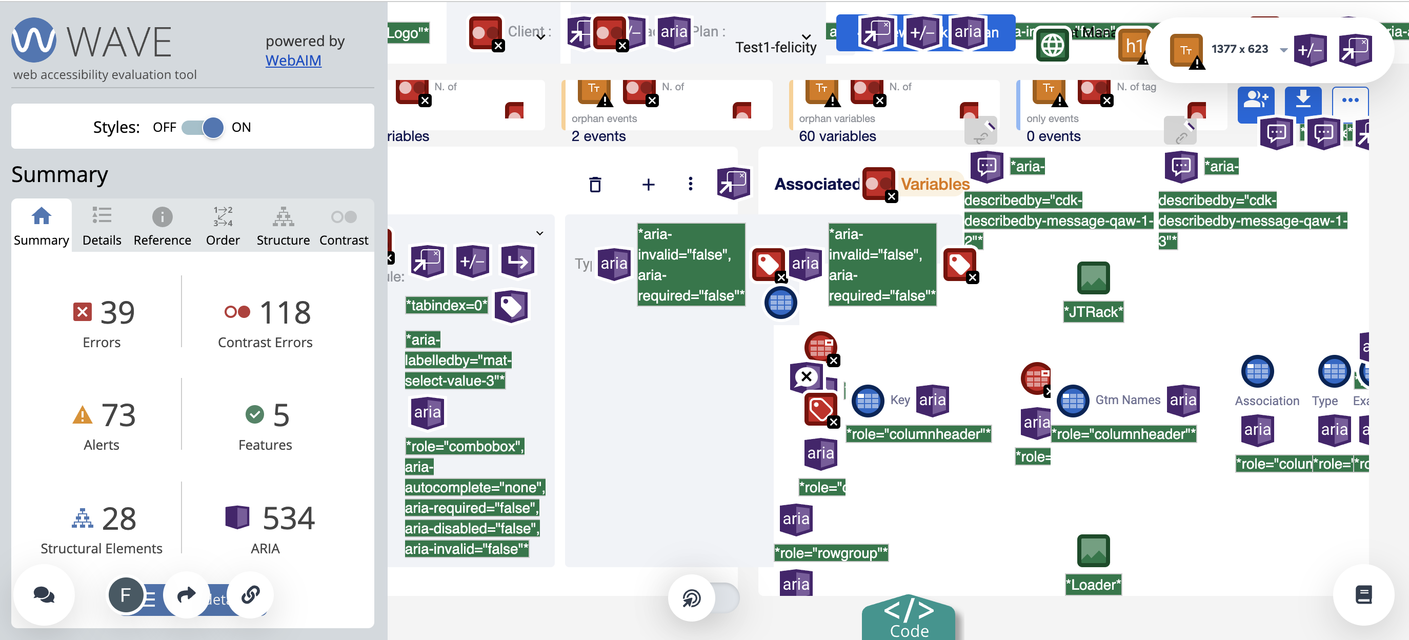
3. WCAG Accessibility Assessment (601 findings)
Using the WAVE tool, I conducted a comprehensive accessibility audit that uncovered 601 findings: 37 errors, 38 alerts, 442 ARIA elements, 69 contrast errors, 12 structural elements, and 3 features. The 69 contrast errors alone represented significant compliance risk.
4. Mixpanel Behavioral Analytics
I analyzed actual usage data to understand what users were doing -- not just what they said they were doing. The results were revealing: 16% of users ended their session upon simply seeing the main indicator page. Only 45.93% of users actually completed the core task of exporting a tracking plan from login. The average time between creating and exporting a tracking plan was 8.6 minutes, with 11.5 tracking plans exported per week.
5. Competitive Benchmarking
I analyzed three industry competitors -- Google Tag Manager (4 million visits, 8.65 pages per visit), Ensighten Manage, and Adobe Experience Platform Launch -- across tag management, usability, data management, and security dimensions. This produced J+Track's first strategic competitive intelligence, revealing that its strengths in complex tag systems and documentation were offset by weaknesses in GA4 feature integration and adoption support.
6. SUS Baseline (66.6)
I established a System Usability Scale baseline of 66.6 with 5 participants -- below the 68 threshold considered "good." This gave us a measurable starting point. I also ran multi-scenario usability testing with 16+ individual task evaluations, measuring completion rates from 100% (basic operations) down to 0% (detecting modified events).
The Transformative Discovery: The Workaround Ecosystem
The most important finding did not come from any single method -- it emerged from the intersection of interviews and usability testing. Users had built an entire parallel workflow around J+Track's limitations:
- Chrome extensions: 30+ per average user (Adsworth, Pomegranate, Omnibug, Dataslayer)
- Internal tools: Snorkel, an internal tool for GTM configuration mapping
- Spreadsheets: Excel and Google Sheets for simpler projects
- Past plans as templates: Using previous tracking plans as reference documents
- JavaScript solutions: Custom scripts to fill product gaps
During usability testing, I directly observed users creating new Google Sheets tabs and copying event implementation tabs to preserve work that J+Track would overwrite on re-export. This discovery reframed the entire product challenge from "improve the interface" to "integrate the workflows users have already built." The gap between assumed and actual user behavior was far larger than anyone expected.
J+Report: Scaling Information Architecture Through User-Centered Research
For J+Report, I ran a parallel multi-method program:
User Interviews (5 participants, 4 countries)
I interviewed BI Managers, Data Analysts, Data Engineers, and CSMs across Australia, Brazil, France, and Israel to understand the full user landscape -- from novice users who struggled with basic source connections to 7-year experts who found the interface limiting at scale.
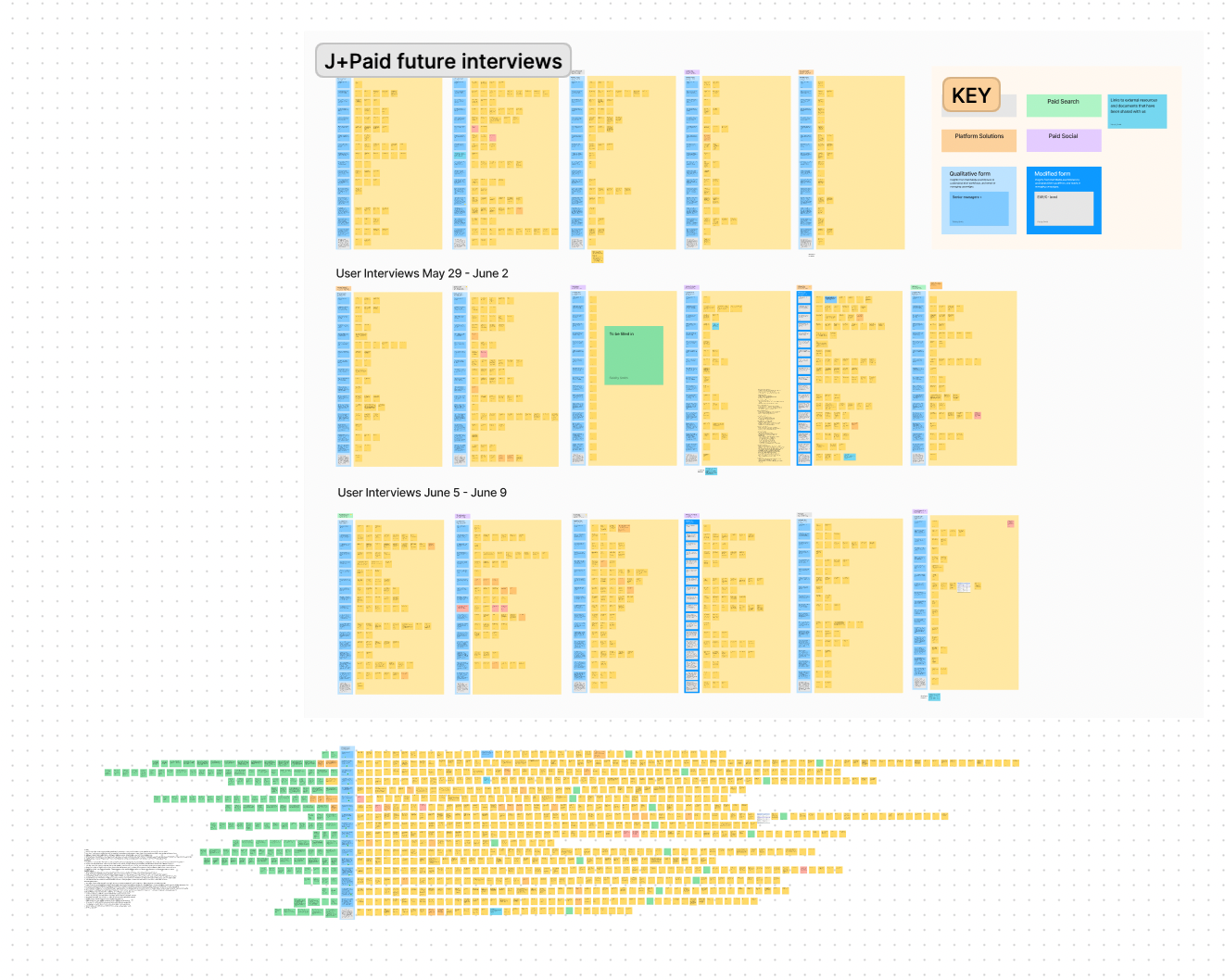
Card Sorting Workshop (5 participants, 65 connectors, 75 minutes)
This was the centerpiece of the J+Report research. I designed and facilitated a remote card sorting workshop where five participants from different geographies collaboratively categorized 65 data source connectors. The goal was to establish a user-validated information architecture that could scale to 175+ connectors. The workshop produced approximately 13 categories (Analytics, CRM, Data Warehouse, Display, Open Data, Organic Social, Paid Social, Project Management, Retail, Search, Search Ads, Universal/Ad hoc, Visualization) that reflected how users actually think about data sources -- not how the engineering team had organized them.
The response was immediate and enthusiastic. One participant, a BI Manager, said: "It's the first time I'm noticed that all who work with a tool or in the same capability have the needs." Another wrote: "I love the way you conducted the J+Report Workshop. Great idea & job to get users ideas and incredible use of the tool to have teamwork!"
User Experience Survey (11 respondents, 28 questions)
I deployed a structured survey covering difficulty ratings, connector familiarity, perceived features, usability ratings, time-on-task, and workflow efficiency. The average difficulty rating for connecting data sources was 4.1 out of 10, with connection times ranging from under 3 minutes (CSV) to 6-10 minutes (exotic sources, Google Ads).
Prototype Usability Testing with A/B Navigation Testing
I built an interactive Figma prototype and tested three navigation approaches. Screen B won unanimously in A/B testing -- a clear, user-validated design direction.
Design Process
J+Track: From Audit to Redesign
I synthesized six research methods into a 62-page UX Foundation document -- the first comprehensive evidence base J+Track had ever received. The document served simultaneously as a research deliverable and an organizational education tool, explaining each methodology (SUS, SEQ, Bastien & Scapin criteria, Sankey diagrams) alongside the findings.
I separated recommendations into two tracks:
- Quick wins: Legibility improvements, design standards alignment, visual identity consistency, wording clarification, error notification improvements -- changes that could ship immediately
- Long-term roadmap: Monitoring improvements, feature additions, onboarding redesign, documentation integration -- structural changes requiring engineering investment
The quick wins included four before/after screen comparisons demonstrating immediate hierarchy, readability, and layout improvements.
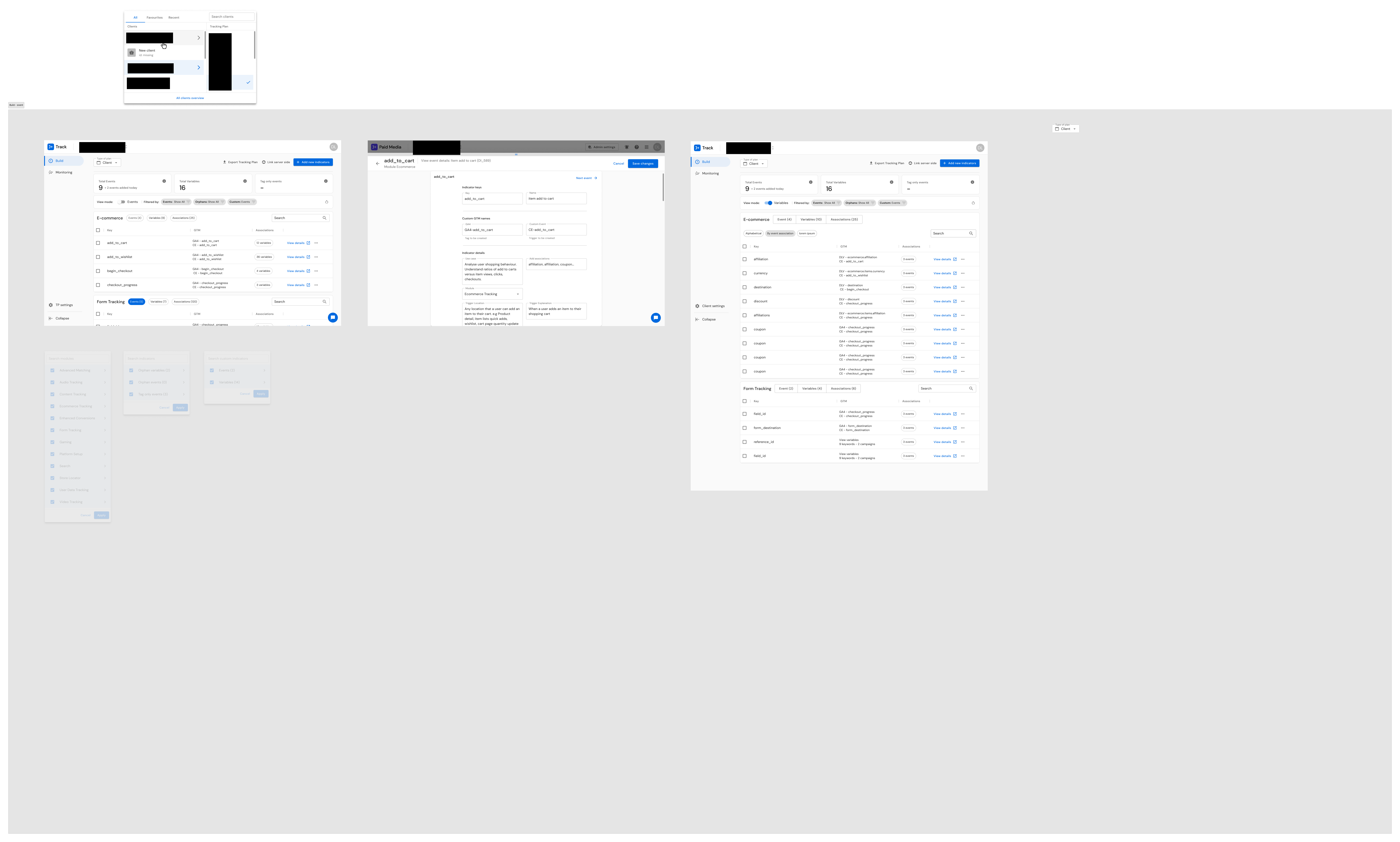
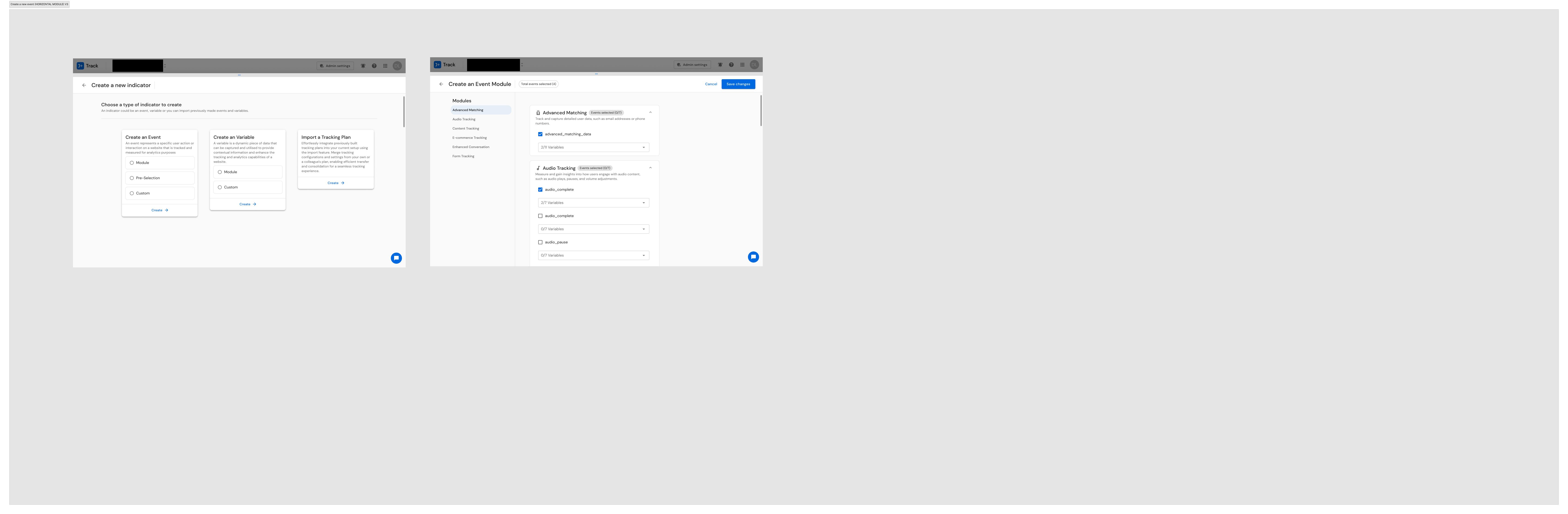
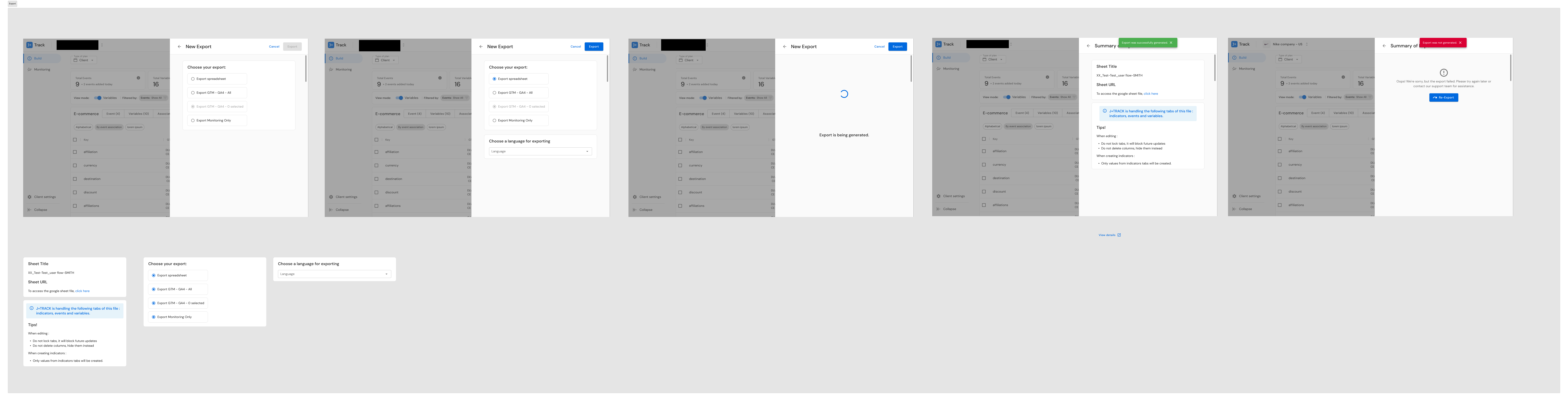
For the V2.0 redesign, I produced 28+ screens addressing the top usability issues: events creation (modules, custom, preselection), variable management, tracking plan creation and import, and access rights. Each design decision traced directly to research findings -- the audit severity ratings drove priority, the interview insights informed interaction patterns, and the competitive benchmarking shaped feature scope.
J+Report: From Research to 44+ Wireframes
I synthesized J+Report findings into five major pain point themes with ten prioritized opportunities:
- Streamlined data source linking -- simplify the connection process
- Enhanced connector accessibility -- improve navigation and search for 175+ connectors
- Expanded data source options -- support the growing connector ecosystem
- Improved error handling -- make error messages actionable, not cryptic
- Simplified UX with better support -- reduce cognitive load for non-expert users
The design phase produced 44+ wireframe screens covering the complete product: login, pipeline management, sources, destinations, library of connectors, credentials management, admin pages, client settings, dashboard, bulk actions, landing pages, views configuration, data preview, scheduling, and members management. I iterated through four major versions of use case documentation (V1 through V4.0), refining the design with each pass.
Building UX Documentation as Organizational Infrastructure
Beyond the individual product deliverables, I built a 45-slide UX Documentation deck that served both products. This was not just a presentation -- it was the first structured UX knowledge base at Jellyfish, codifying research methodology, personas, journey maps, pain point analysis, and design rationale in a single, searchable reference. The deck explained UX concepts (personas, journey maps, SUS, SEQ, user flows, affinity mapping) inline with the findings, effectively training the organization on research methodology while delivering project results.
Solution
For J+Track:
- A comprehensive evidence base establishing the first measurable usability baseline (SUS 66.6), identifying 50 prioritized usability issues, mapping 601 accessibility findings, and documenting the complete workaround ecosystem
- A V2.0 redesign (28+ screens) addressing high-severity issues identified in the audit
- A reusable heuristic evaluation framework that could be applied to any Jellyfish product
- A competitive intelligence foundation providing the first strategic comparison with industry leaders
For J+Report:
- A user-validated information architecture for scaling from 60 to 175+ connectors
- 44+ wireframes covering the complete product redesign
- Five prioritized pain point themes with ten actionable opportunities
- A clear design direction validated by unanimous A/B test results
For the organization:
- The first structured UX documentation system at Jellyfish
- Reusable research instruments: structured interview guides, survey templates, audit frameworks, and workshop facilitation methodologies
- Evidence that systematic UX research delivers actionable, business-relevant insights -- a proof point that helped establish research as a valued practice
Results & Impact
50
Usability issues identified (J+Track)
601
WCAG accessibility findings
SUS 66.6
Baseline established (J+Track)
28+
V2.0 redesign screens
44+
J+Report wireframes
6
Distinct research methods applied
4
Countries in user research
62 pages
UX Foundation document
J+Track Outcomes
- 50 specific usability issues identified and severity-prioritized
- 8 high-severity issues requiring immediate attention (data loss risk, visual inconsistency, icon/CTA confusion, form placement, layout confusion, CTA consistency, event save failure, compatibility)
- SUS baseline of 66.6 established -- the first measurable usability metric for the product
- 601 WCAG accessibility findings documented, including 69 contrast errors
- Workaround ecosystem discovery fundamentally reframed the product strategy from "improve the interface" to "integrate the workflows users have already built"
- Competitive intelligence foundation established against Google Tag Manager, Ensighten Manage, and Adobe Experience Platform
- V2.0 redesign (28+ screens) produced and delivered
J+Report Outcomes
- User-validated information architecture for 175+ connectors (card sorting with 65 connectors across 5 participants)
- Unanimous A/B preference for Screen B navigation design
- First structured UX documentation for J+Report
- 44+ wireframes covering the complete product
- User feedback: "I love the way you conducted the J+Report Workshop. Great idea & job to get users ideas"
Organizational Outcomes
- First systematic UX research practice established across the Jellyfish product suite
- Multi-method research methodology proven and documented for reuse
- A 45-slide UX Documentation system serving as both research record and organizational education
Reflections
Running two concurrent research programs as a solo designer was one of the most demanding stretches of my career -- and one of the most formative. It forced me to be ruthless about methodology selection, efficient in execution, and disciplined about documentation.
What I learned about research methodology: The Bastien & Scapin framework, which I brought from my French academic training, proved to be a genuine differentiator. Its eight-criteria structure provided more actionable granularity than standard heuristic approaches, and the structured spreadsheet format made it immediately useful for engineering prioritization. I have continued to use this framework in subsequent roles.
What I learned about user behavior: The workaround ecosystem discovery on J+Track fundamentally changed how I approach product research. Users do not simply tolerate gaps -- they build entire parallel workflows around them. If your research does not surface these workarounds, you are designing for a version of user behavior that does not exist. I now specifically probe for workaround tools and shadow workflows in every interview protocol I design.
What I would do differently: I would have pushed harder for post-implementation metrics. The V2.0 designs were delivered, but I do not have adoption or task completion data from after the redesign shipped. Establishing a measurement plan before the redesign -- not just a baseline -- would have made the before/after story significantly stronger.
Beyond Research: J+Carbon — Sustainability in Advertising
While running concurrent research across J+Track and J+Report, I also contributed to the design of J+Carbon — a carbon emission calculator for digital advertising, developed in partnership with Scope3, a recognized leader in advertising carbon measurement. The product enables advertisers to measure and begin reducing their campaigns' carbon footprint — a capability that barely existed in the advertising industry.
The design challenge: J+Carbon sat at the intersection of two domains that rarely overlap: advertising technology and environmental sustainability. Advertisers are accustomed to optimizing for ROAS, CTR, and conversion rates — not carbon emissions. The design needed to make environmental impact data as intuitive and actionable as the performance metrics advertisers already use daily.
What I designed: The primary flow enabled advertisers to generate eco-reports directly from their advertising platform data across DV360, Meta, and YouTube — three of the largest digital advertising platforms. I designed a secondary path for CSV upload and analysis, extending coverage to SA360, Pinterest, Snapchat, TikTok, and Microsoft. Because carbon emissions from digital advertising was a novel concept for most users, I designed a Resource Library as a first-class product feature — not a help center tucked away, but an integral component that helps users understand what they are measuring and why it matters.
What this demonstrates: The same silo-bridging pattern that connected users across four countries to product decisions also connected advertising performance optimization with environmental impact measurement. Responsible technology has the greatest impact when it meets practitioners where they already work — embedded in the tools they use, not siloed in a separate initiative.
Core patterns demonstrated
- Territory Mapping: Six distinct research methods applied to J+Track before proposing any design changes; multi-method triangulation across J+Report
- Infrastructure Building: The heuristic audit framework, UX documentation system, and research templates all became reusable organizational tools
- Silo Bridging: Connected users across four countries to product decisions through workshops and research; documented the gap between product team assumptions and actual user behavior
- Scaling Through Teaching: The 62-page UX Foundation and 45-slide documentation deck educated the organization on UX methodology alongside delivering project findings
- Operating Above Title: As a UX Designer, I performed the roles of UX researcher, heuristic evaluation specialist, accessibility auditor, analytics analyst, competitive strategist, and product designer -- a one-person UX department spanning six distinct functions
Key Artifacts
J+Track UX Foundation (62 pages)
Bastien & Scapin Ergonomic Audit Spreadsheet
J+Track V2.0 Figma Screens
J+Track Quick Fixes
J+Report Card Sorting Workshop Output
J+Report Wireframes
UX Documentation Deck (45 slides)
User Research Presentations
Related Case Studies
See all projectsFrench Ministry of Defense
Redesigning the French Ministry of Defense web portal across 26 agencies
26 agencies, each with its own communication team and editorial process. 9 co-design workshops, 100+ participants from military and civilian organizations, 50+ site benchmarks, and reusable research infrastructure built to scale across the ministry.
Government UXJellyfish / BrandTech Group
Automating analyst workflows across 3 internal products
Three internal tools, one common pattern: replacing manual processes with designed interfaces. J+IQ cut competitive reports from 72 hours to 15 minutes, saving 1,000+ hours across 130 users. J+Bidding replaced a 5-hour API process with a 1-minute interface, supporting $800K+ in revenue. J+Carbon shipped a carbon footprint calculator in under two months.
Workflow Automation